Enhancing Decision-Making in Sports Through Data Management and Visualisation
Feb 06, 2025
By Jacob Hurwitz
Jacob is a Graduate Research Assistant and PhD student at Mississippi State University in the US and is a Sport Scientist at Vegas Golden Knights.
In today’s world of sport science, data is everywhere. From GPS tracking and force plates to athlete workload monitoring, teams and practitioners have access to more data than ever before. But raw data alone isn’t enough – it’s how we analyse, visualise, and communicate that information that truly drives performance improvements. This is where data visualisation tools like Power BI and Tableau become game-changers for sport scientists, coaches, and performance staff.
How Power BI Transformed My Sport Science Workflow
Before using Power BI, reporting data often involved Excel workbooks. As more datasets from different technology devices were added, the workbooks became slower and harder to manage. Storing large amounts of raw data with complex calculations became increasingly challenging. Additionally, making the Excel workbook accessible to all stakeholders while keeping it updated was difficult.
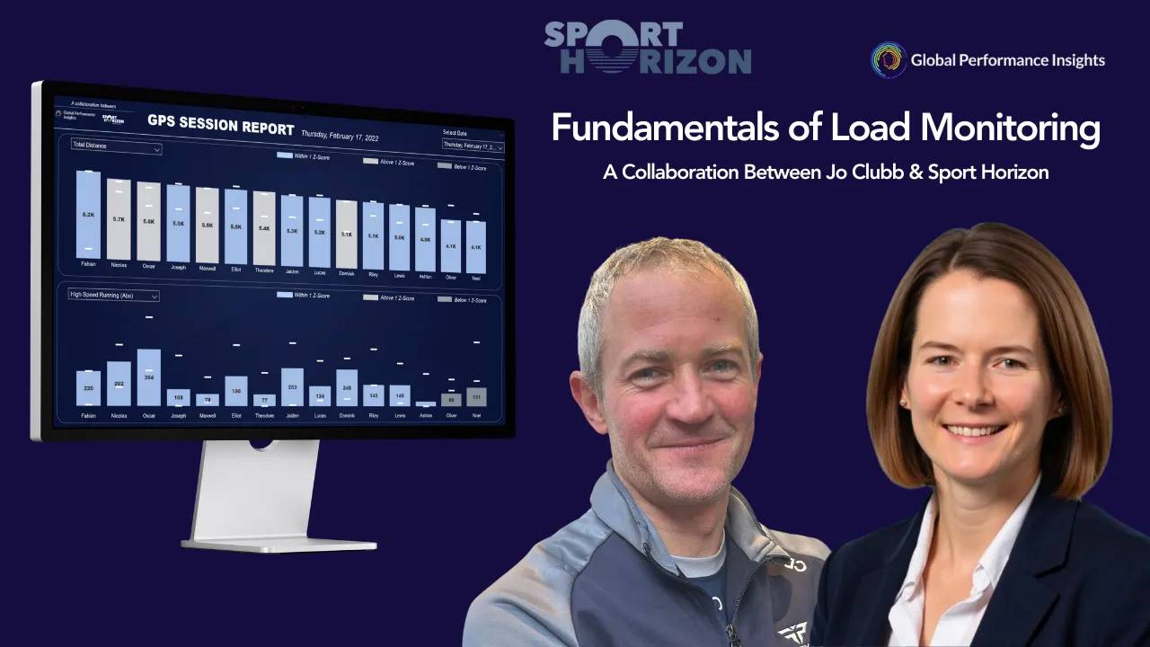
As data continues to grow in value, how it is stored, shared, and presented has become a critical factor in helping decision-makers quickly interpret and act upon it. That’s when I came across Sport Horizon’s Power BI and Tableau courses for Sport Scientists, which provided a structured approach to managing data and building interactive dashboards tailored to sports performance. These courses offered step-by-step guidance on structuring and cleaning sports data for effective analysis, building dynamic dashboards that highlight key performance metrics, and using visuals to tell a compelling story rather than just presenting numbers.
By applying these concepts, I was able to transform my reporting workflow. I began creating interactive dashboards that allowed different stakeholders to explore trends, compare players, and make informed decisions. The improvement in communication and engagement was immediate. One of the biggest advantages of integrating Power BI into my workflow was the ability to automate and streamline data updates. Unlike Excel, which required constant manual adjustments, Power BI allowed me to create dynamic reports that pulled in new data faster. This saved time and ensured that coaches and performance staff had access to the latest insights without delays.
From Raw Data to Actionable Insights: The Role of Sport Scientists
As sport scientists, one of our biggest responsibilities is bridging the gap between data collection and performance application. It’s not just about having access to numbers; it’s about ensuring those numbers are understood and used effectively by coaches, strength and conditioning staff, medical staff, and athletes. This process begins with data collection, where accuracy and reliability are essential. Whether it’s GPS tracking, force plates, or wellness surveys, the quality of the data directly impacts its usefulness in decision-making.
Once the data is collected, it must be processed and structured properly to avoid misinterpretation. Cleaning and organising the information ensures that it can be analysed in a meaningful way. Without this step, even the most advanced metrics can lead to incorrect conclusions or misleading insights. After processing, data visualisation plays an important role in making complex information more accessible. Creating easy-to-read dashboards that highlight key trends and important insights allows coaches and staff to quickly interpret the information and apply it to training and performance strategies.
The final step in this process is decision-making. Communicating findings in a clear and actionable way helps coaches adjust training loads, modify recovery strategies, or refine match-day tactics based on objective information. With the right tools and training, data becomes a conversation starter rather than an obstacle. Instead of asking, “What does this data mean?” coaches can confidently say, “Here’s what we need to adjust based on this trend.” By transforming raw data into actionable insights, sport scientists play a key role in improving athlete performance and ensuring that every decision is backed by reliable information.
Why Data Visualisation Matters in Sports Performance
The ability to turn complex data into clear, meaningful insights is one of the most valuable skills in sport science today. Whether tracking an athlete’s workload, monitoring fatigue levels, or evaluating performance trends over a season, data visualisation simplifies decision-making and increases the impact of sport scientists. In a high-performance environment, coaches and staff do not have time to sift through raw data or interpret large spreadsheets. Instead, they need concise, visually engaging reports that highlight key metrics, trends, and statistical insights in a way that is easy to understand and act upon.
By transforming raw data into meaningful visuals, sport scientists can enhance communication and collaboration across an entire performance team. Effective data visualisation allows coaches to see patterns in training loads, identify potential injury risks, and adjust programming before issues arise. It also helps athletes understand their own performance metrics, providing them with clear feedback on areas for improvement. When data is presented in a digestible format, it becomes a more powerful tool for driving informed decisions that impact match-day performance and long-term athlete development.
Final Thoughts
My experience with Sport Horizon’s courses has completely changed the way I approach sports data. The ability to store, clean, organise, interpret, and build interactive, coach-friendly dashboards has not only improved communication but has also enhanced how data is used to inform training and performance strategies. By learning how to structure data efficiently and present it in a way that is both engaging and actionable, I have been able to bridge the gap between raw data and real-world application. This shift has made my workflow more efficient while increasing the level of trust and engagement from coaches, athletes, and performance staff. When data is presented in a way that is easy to understand, it fosters more productive discussions and leads to more informed decisions.
For anyone working in sports performance, I highly recommend investing time in learning tools like Power BI and Tableau. Platforms like Sport Horizon provide structured courses designed specifically for sports professionals, making it easier than ever to gain these valuable skills and make data work for you, not against you. As technology continues to advance, the ability to visualise and interpret data effectively will only become more essential, helping teams and athletes gain a competitive edge in an increasingly data-driven industry. Developing these skills is not just about analysing numbers – it is about turning information into actionable insights that drive performance, enhance communication, and ultimately maximise athlete potential.
Stay connected with news and updates!
Join our mailing list to receive the latest news and updates from our team.
We hate SPAM. We will never sell your information, for any reason.